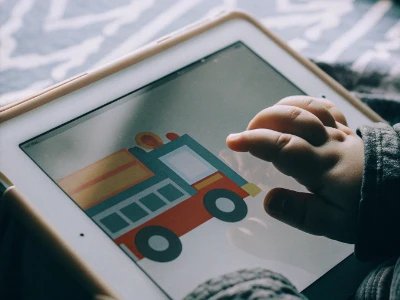
Walk into a children's museum. Notice the intentional design: calm colors, clear signage, thoughtful spacing. Interactive exhibits engage without overwhelming. Materials feel substantial, not cheap. Audio is clear, not harsh.
Now open most toddler apps: garish colors screaming for attention, cluttered interfaces, tinny synthesized sounds, aggressive stimulation competing for clicks.
Why the difference? Museums understand that quality design enhances learning. Most app developers prioritize attention capture over developmental appropriateness.
But some apps—the best ones—apply museum-quality design principles to digital experiences. This guide explains why premium design matters and how to recognize it.
What Is Premium Design?
Premium design doesn't mean expensive or pretentious. It means thoughtful, intentional choices that respect users and enhance experience.
Core Principles
Visual clarity: Clean layouts, generous white space, clear focal points. Users understand immediately what to do.
Appropriate stimulation: Engaging without overwhelming. Color, movement, and sound carefully calibrated for age.
Quality materials: Professional illustrations or photography. Recorded audio, not synthesized. Attention to craft.
Intentional restraint: Not using every possible effect. Choosing what enhances experience, discarding what distracts.
Respect for users: Design assumes intelligence. Doesn't talk down. Doesn't manipulate.
Why Museums Get This Right
Children's museums succeed because they:
- Hire designers who understand child development
- Test exhibits with actual children
- Prioritize learning outcomes over attention metrics
- Value craft and quality materials
- Create experiences rather than just attractions
Quality apps apply identical principles to digital experiences.
Visual Design: Why Calm Beats Chaotic
Toddler apps often use aggressive visual design assuming children prefer bright, busy chaos. Research says otherwise.
The Overstimulation Problem
Garish, chaotic design creates problems:
- Cognitive overload: Too much visual information prevents focus on learning content
- Stress response: Overwhelming stimulation triggers fight-or-flight, not learning mode
- Shortened attention: Constant stimulation trains children to need ever-increasing intensity
- Reduced learning: Energy goes to processing visual chaos, not absorbing content
Apps using neon colors, flashing elements, and cluttered layouts capture attention through stress, not engagement.
Premium Visual Design Characteristics
Calm color palettes:
- Muted, harmonious colors rather than garish primaries
- Sufficient contrast for readability without harsh brightness
- Color used purposefully, not randomly
- Palette respects developing visual systems
Generous white space:
- Elements have room to breathe
- Clear focus on important content
- Reduces visual confusion
- Respects that toddlers process information more slowly than adults
Quality illustrations:
- Thoughtfully drawn or photographed, not stock graphics
- Consistent visual style throughout
- Appropriate detail—neither too complex nor too simple
- Beautiful enough to engage aesthetic sense
Clear visual hierarchy:
- Important elements stand out
- Navigation is intuitive
- No mystery about what to tap or where to focus
Example: Little Wheels Visual Design
Little Wheels apps demonstrate premium visual principles:
- Calm palette: soft greens, warm golds, natural wood tones
- Custom 3D vehicle models: not stock graphics, professionally rendered
- Generous spacing: each element has room, no clutter
- Clear focus: obvious what children should interact with
- Consistent style: unified visual language throughout
Result: children engage longer, focus better, learn more effectively.
Audio Design: Why Quality Sound Matters
Audio quality affects learning more than parents realize.
The Problem With Cheap Audio
Low-quality app audio typically features:
- Synthesized speech: Computer-generated voices with unnatural pronunciation
- Harsh sounds: Tinny, grating audio that irritates rather than engages
- Inconsistent volume: Some elements too loud, others too quiet
- Poor recording quality: Background noise, echo, compression artifacts
These problems aren't just annoying—they interfere with learning.
Why Quality Audio Matters for Development
Speech learning: Toddlers learning to talk need clear audio models. Synthesized speech provides poor pronunciation examples. Professional recording ensures accurate speech patterns.
Auditory processing: Developing auditory systems process clear sounds better than distorted ones. Quality audio reduces cognitive load.
Engagement: Pleasant sounds encourage continued use. Harsh audio creates aversion.
Sensory respect: Young children's hearing is sensitive. Harsh sounds are physically uncomfortable.
Premium Audio Characteristics
Professional recording:
- Human voice, clearly recorded in studio environment
- Consistent quality across all audio elements
- Appropriate volume levels throughout
- Clean audio without background noise or distortion
Authentic sounds:
- Real recordings rather than synthesized approximations
- For vehicle apps: actual vehicle sounds recorded clearly
- For music apps: quality instruments, not MIDI
Appropriate mixing:
- Speech clear over background elements
- Sound effects enhance rather than overwhelm
- No jarring transitions or volume changes
Example: Little Wheels Audio Quality
Talk & Listen demonstrates premium audio:
- Every vehicle name professionally voice-recorded
- Authentic vehicle sounds (real engines, real horns)
- Clear speech modeling for pronunciation practice
- Consistent, pleasant audio throughout
- No harsh or grating sounds
This audio quality isn't luxury—it's providing proper speech models for learning.
Interaction Design: Thoughtful Over Flashy
How apps respond to touch affects both engagement and learning.
The Overstimulation Trap
Many apps respond to every tap with:
- Explosions of particles
- Loud celebratory sounds
- Flashing colors
- Vibration
This overstimulation creates problems:
- Children seek the stimulation, not the learning
- Difficult to tell what's important feedback vs. decoration
- Trains need for constant excitement
- Overwhelms rather than teaches
Premium Interaction Design
Responsive clarity:
- Immediate response to taps—no lag
- Clear indication of what was tapped
- Appropriate feedback without overdoing it
Purposeful feedback:
- Feedback serves learning, not just excitement
- Success celebrated appropriately, not excessively
- Mistakes handled gently
Natural pacing:
- Time to process between interactions
- No rushing children through content
- Allows exploration at toddler pace
Why Premium Design Doesn't Cost More
Many assume premium design means premium price. Not necessarily.
The Time Investment
Premium design requires:
- More development time (can't use cheap templates)
- Professional assets (illustrations, audio recording)
- Careful testing and iteration
- Attention to craft and detail
This investment costs developers more—but ethical developers don't pass all costs to users.
Fair Pricing Philosophy
Quality indie developers often price premium apps affordably:
- Little Wheels Talk & Listen: $4.99 despite custom 3D models and professional audio
- Little Wheels Create & Play: $4.99 despite unique DJ mixing feature and physics engine
Premium reflects care, not necessarily price. These developers value accessibility alongside quality.
Where You Pay Premium
Ironically, low-quality apps often cost more long-term:
- Free apps with $9.99/month subscriptions = $119.88/year
- Cheap apps ($0.99-2.99) that get abandoned = multiple purchases as you search for quality
- Ad-supported "free" apps = hidden costs in attention, data, and accidental purchases
Premium design at fair one-time prices often costs less than accumulating mediocre alternatives.
Teaching Visual Literacy Through Quality
Premium design does more than enhance current learning—it shapes aesthetic development.
Children Learn Design Through Exposure
Toddlers exposed primarily to garish, chaotic design learn:
- Overstimulation = normal
- Chaos = how digital experiences should feel
- Loud = how to get attention
Toddlers exposed to thoughtful, quality design learn:
- Calm can be engaging
- Clarity enhances experience
- Quality matters
- Beauty serves purpose
Building Taste
Just as quality picture books develop visual literacy, quality apps shape digital taste:
- Children who use well-designed apps develop preference for quality
- They become better at evaluating digital experiences
- They expect thoughtfulness, not just stimulation
This foundation affects how they engage with technology throughout life.
How to Recognize Premium Design
Evaluating design quality before purchasing.
Visual Quality Checks
Look at app store screenshots:
- Color palette: Harmonious or garish?
- Spacing: Generous white space or cluttered?
- Typography: Clear, appropriate fonts or generic defaults?
- Illustrations: Custom artwork or obvious stock graphics?
- Overall feel: Calm and intentional or chaotic?
Audio Quality Checks
If demo videos are available:
- Voice quality: Human recorded or synthesized?
- Sound effects: Pleasant or harsh?
- Mixing: Balanced or jarring?
Developer Care Signals
Premium design correlates with developer values:
- Detailed descriptions: Developers proud of design explain their choices
- Design philosophy: Some developers articulate design values
- Portfolio quality: Other apps from same developer also well-designed?
- Update attention: Continued refinement shows ongoing care
Premium Design Examples
Apps demonstrating museum-quality design principles:
Little Wheels Collection
Talk & Listen:
- Custom 3D vehicle models
- Calm, natural color palette
- Professional voice recording
- Authentic vehicle sounds
- Generous spacing, clear hierarchy
Create & Play:
- Thoughtful toyroom navigation
- Physics-based interactions feel natural
- Quality audio in DJ mixing feature
- Consistent visual language
Sago Mini Apps
- Distinctive, charming illustration style
- Warm, inviting color palettes
- Clear, simple interactions
- Quality audio design
Toca Boca (Original Apps)
- Unique visual style
- Thoughtful sound design
- Clear, intuitive interactions
- Attention to detail
These examples prove premium design is achievable at accessible prices when developers prioritize quality.
The Bottom Line on Premium Design
Premium app design isn't about luxury or aesthetics for their own sake. It's about:
- Respecting children's developing systems (visual, auditory, cognitive)
- Enhancing learning outcomes through clarity and appropriate stimulation
- Teaching visual literacy and appreciation for quality
- Creating experiences that engage without overwhelming
Premium design serves development. It's pedagogical choice, not aesthetic indulgence.
Your toddler deserves apps designed with the same care as quality picture books or children's museum exhibits. These apps exist at fair prices from developers who value craft.
Choose apps where visual design, audio quality, and interaction patterns show thoughtfulness. Choose developers who care about design as much as functionality.
Your child's developing aesthetic sense—and their learning outcomes—will benefit.
Premium isn't about price. It's about respect, care, and understanding that quality matters.
 Frequently Asked Questions
 Ad-free & offline ready